Friday, 14 May 2021

Muscle Structure. Combining Black and Colour Media

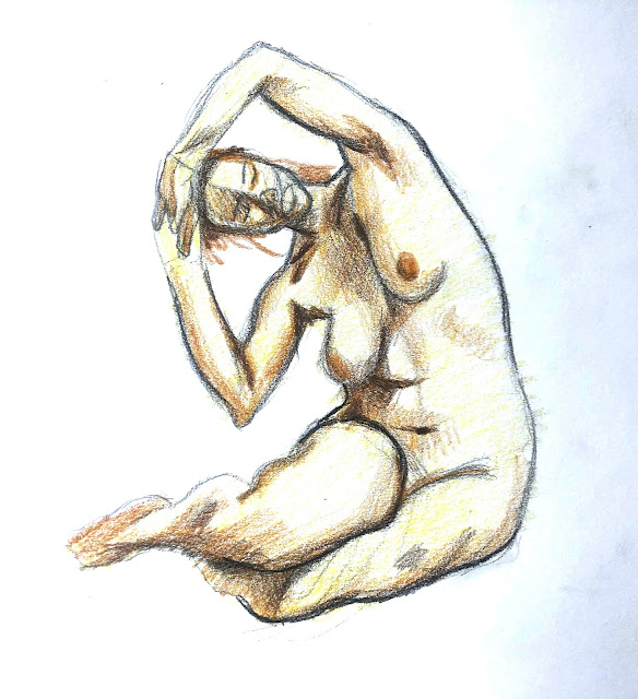
    These are the coloured media with black media, I chose the do the male and female separately so I can focus on each individual drawings on their own. For the references I wanted to choose some really interesting poses before drawing and i'm really happy with the poses I chose.

    It was a little difficult to do the colour as there weren't much colour variation on the skins it was all roughly the same colour so I had to make some of my own decisions on changing/faking some of the hue changes on the skin.


Thursday, 13 May 2021

Virtual Tour – National Museum of the USAF

    Looking through the online museum there was a lot of interesting planes for me to draw, so it was pretty hard to choose one from so many, at last I decided on a plane to draw, it was very difficult to do this drawing as the museum was pretty well lit up and as this was metal there was not a lot of different value on the plane and the value changes on the plane was all very minor.


Virtual Tour - Hull Streetlife Museum of Transport

     For the museum drawings I really liked the bus that was at the front of the museum so for my final render drawing I decided to draw the bus, furthermore the front of the bus is very interesting with the lights and the grill.


Human Body Dynamics. Using Indian Ink and Ink Washes

    These are the timed sketched for my ink and wash experiment, the time I set myself is 5 minute each, I really like and enjoyed some of the marks made with wash as it was very easy to use the brushes to create the different planes changes in value.
 

Wednesday, 12 May 2021

Ink Wash in Traditional Chinese Painting

    This is the painting I chose from the China Online Museum, I really liked this one as it uses a lot of the techniques to capture the scene, by using ink and was there are hard lines and edges from the ink itself and also softer edges created by wash.

    For the rocks instead of drawing out all the details he used a bit of a wet brush to make those very detailed textures for the rocks, from some of the ways the makes are created it looks like the brush was put on paper and flicked off to create those sharp lines and thin lines, as the ink is mixed with water it isn't as dart as the pure ink areas therefore it doesn't take over the painting.

    From the leafs it looks like the creator used some sort of stabling techniques too. This, just like the textures on the rocks, is a really quick and easy way of drawing objects with a lot of volume, density and details, however instead of using ink on all of the leafs the creator of this painting took in account of atmospheric perspective therefore the leafs that are further away from the view point is lighter than the ones at the front.

    Lastly, there are a lot of  negative space in this painting too, for example the creator haven't painted in the cloud/sky nor the river which makes it look like it was blended together and almost added dreamy feeling to the overall painting.


Focus on Anatomy

     These were some timed sketches from the video, I chose the ones that I found was challenging and interesting, the last one I really enjoyed drawing as it was really dynamic and a lot of interesting muscles being squashed and pulled, as I really liked this pose I chose to take a little more time on this one than the other 2.


Virtual Tour - The National Portrait Gallery

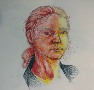
    This was the colour portrait I did, this was a lot more fun than I anticipated, the point I wanted to make sure I really nail was the colour variations on the skin, the subtle value and colour changes.


Composition Part 3. Colour Aesthetics and Drawing Techniques

 These are the 2 portraits I chose to do for my warm and cold colour portraits. It was a challenge to do the cool colour tone as it was difficult to get the correct value as I only had 1 colour pencil that is cool colour I have, compared to the warm portrait it was a little more easier as I can use yellow and red to act as values and also tone changes.


Thursday, 29 April 2021

Boss Battle - Final Render

     This is the final render of the scene, I never make or design environments, so this project was very difficult for me as I'm no really use to painting or designing environments. However, by using megascans and photobashing it had made the overall process much easier than if I wasn't allowed to use this technique.


Wednesday, 28 April 2021

Boss Battle - Preparation - Mega Scan

    After finding a good composition and cool lighting I started to use  Megascans, this is a quick and efficient way of building a level really quickly, I found all the objects from my initial 3D block out and placed them in here, now I will paint over this which will make things a lot easier and quicker. I'm happy with how the scene turned out and happy with the objects that I have in this scene.


Natural vs Artificial - Scene - Render

    After placing all the particles in the scene, even though the particles are very simple and there is not many of them, it still made a huge difference in the overall liveliness of the level in general. It was a great touch on top of the level.
    
    If I had the chance to redo this project I would have made a more noticeable change to the room, because even though this room is filled with meshes and particles it still looks the same as the default room so if I change the overall shape of the room more I think it will make the overall level more interesting.


Muscle Structure. Combining Black and Colour Media

    These are the coloured media with black media, I chose the do the male and female separately so I can focus on each individual drawings ...