Showing posts with label Traditional. Show all posts

Friday, 14 May 2021

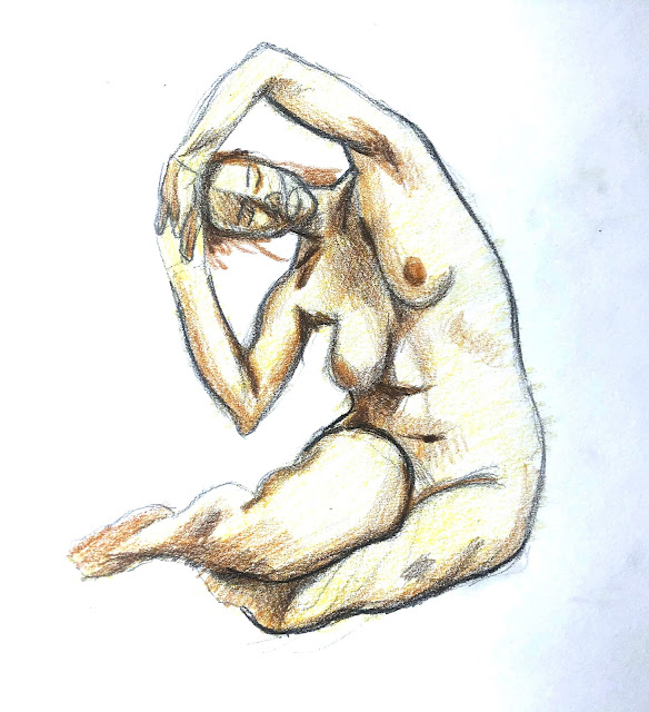
Muscle Structure. Combining Black and Colour Media

    These are the coloured media with black media, I chose the do the male and female separately so I can focus on each individual drawings on their own. For the references I wanted to choose some really interesting poses before drawing and i'm really happy with the poses I chose.

    It was a little difficult to do the colour as there weren't much colour variation on the skins it was all roughly the same colour so I had to make some of my own decisions on changing/faking some of the hue changes on the skin.


Thursday, 13 May 2021

Virtual Tour - Hull Streetlife Museum of Transport

     For the museum drawings I really liked the bus that was at the front of the museum so for my final render drawing I decided to draw the bus, furthermore the front of the bus is very interesting with the lights and the grill.


Human Body Dynamics. Using Indian Ink and Ink Washes

    These are the timed sketched for my ink and wash experiment, the time I set myself is 5 minute each, I really like and enjoyed some of the marks made with wash as it was very easy to use the brushes to create the different planes changes in value.
 

Wednesday, 12 May 2021

Ink Wash in Traditional Chinese Painting

    This is the painting I chose from the China Online Museum, I really liked this one as it uses a lot of the techniques to capture the scene, by using ink and was there are hard lines and edges from the ink itself and also softer edges created by wash.

    For the rocks instead of drawing out all the details he used a bit of a wet brush to make those very detailed textures for the rocks, from some of the ways the makes are created it looks like the brush was put on paper and flicked off to create those sharp lines and thin lines, as the ink is mixed with water it isn't as dart as the pure ink areas therefore it doesn't take over the painting.

    From the leafs it looks like the creator used some sort of stabling techniques too. This, just like the textures on the rocks, is a really quick and easy way of drawing objects with a lot of volume, density and details, however instead of using ink on all of the leafs the creator of this painting took in account of atmospheric perspective therefore the leafs that are further away from the view point is lighter than the ones at the front.

    Lastly, there are a lot of  negative space in this painting too, for example the creator haven't painted in the cloud/sky nor the river which makes it look like it was blended together and almost added dreamy feeling to the overall painting.


Focus on Anatomy

     These were some timed sketches from the video, I chose the ones that I found was challenging and interesting, the last one I really enjoyed drawing as it was really dynamic and a lot of interesting muscles being squashed and pulled, as I really liked this pose I chose to take a little more time on this one than the other 2.


Composition Part 3. Colour Aesthetics and Drawing Techniques

 These are the 2 portraits I chose to do for my warm and cold colour portraits. It was a challenge to do the cool colour tone as it was difficult to get the correct value as I only had 1 colour pencil that is cool colour I have, compared to the warm portrait it was a little more easier as I can use yellow and red to act as values and also tone changes.


Thursday, 4 February 2021

Self Portrait

    For the reference image I took for this portrait I really wanted to focus on making the portrait as much shadow as possible, so it will be interesting when I draw it. Furthermore, the main idea I had when taking the self portrait was how Rembrandt constructs his own portriats whether it was drawings or paintings, where the subject will be positioned in a  3/4 view and usually where the brightest part of the piece will be the nose and the darkest area of the piece will be on the other side of the face, and i tried follwing that rule as much as I could when taking the reference picture.


     This is the finished peice of the portrait, I used different shading techniques for this one, for the clothing I wanted to convey this roughness of it, so i used a lot of heavy lines and hatching to get the feeling of roughness, and in comparison to the face where the shadings are a bit smoother, though there are still some hatching going on on the face to create some texture.
 

Sunday, 24 January 2021

Human Head Construction

     This is the progression picture of the human skull, I really enjoyed this drawing as i think human skulls are very very interesting object to draw as there are so many interesting shadows, textures and values so i had a lof of fun drawing this.


    This is the final render of the skull drawing, overall the main focus of this drawing was similar to the previous one where the main focus of the drawing other than getting the form down correctly was getting the texture of the drawing to feel like a a skull. 

    I also blended a little part of the skull into the shadows, I really like how this looks so for drawings in the future I will do this more often.


Saturday, 23 January 2021

The British Museum Virtual Tour

    I forgot to take the progression pictures at the start on how I started to draw the figure so there isn't much of progression.


     This is the final rendering of the drawing from the The British Museum Virtual Tour, I found this statue and I really liked the posture of the staute and how the form of the human body was sculpted, and another good thing about his is the face of the statue is very worn so the features of the face is not very obvious therefore i didn't have to spend all the time rendering the face and focus more on the rest of the body.
     

     The one problem I had during this drawing was to get the texture and roughness of the stone, as they texture was very rough so doing a very shading was not gonna correctly convey the texture of the statue so I used hatchng and corss hatching in some of thar shadow areas to create this rought looking material feeling.

Friday, 18 December 2020

Composition Part 2. Landscape and Cityscape

    This is the progression of my Urban drawing, this was taken in Leicester when walking through town, I found this building very interesting and unique so I thought it will be a very good subject to draw.

    During the start of the drawing it was very easy to draw the line art the only challenging task was getting and making sure all the perspective line up and make sense.

    The challenging thing was the shading as it is so different from drawing still life such as fruits and cups as buildings have so much different levels of value sometimes on the same surface so I was kind of lost especially at the start of the shading as I had no clear understanding on what to start first. However, it got easier and easier towards the end as the big value block out has been set therefore all I had to do in the end was get the rendering right.


    Final render:
    This was the finished piece of the drawing, there was a lot of details of the building that I left out as they were very micro details and in my opinion if I added them in it will make the drawing look every messy and which will be a waste of time so in my opinion I believe making the shapes big and simple was the better choice so create a solid piece of drawing.


Sunday, 13 December 2020

Virtual Museum (Natural History Museum)

    For the virtual museum it was very difficult to find a good object to draw and furthermore even if I do find a object due to the virtual tour limitation it was difficult to find a good composition to draw, lastly some times even when the a good composition was found the lighting may not be very good.

    For this drawing it was very fun to draw as I very much enjoy drawing skulls and bones as I personally find them very interesting with all the details. Also, the shadow that will create on the skull due to the imperfections and cavities on the skull will be very interesting to draw.


  This is the final render of the drawing, I made the focus on the skull itself therefore it is really contrasty and the second tusk at the back is something not so important therefore is not as contasty as the tusk at the front and also the skull it self. I also left some of the lines from the sketches I made during the process to make this unfinished feeling, or it won't be as clean compared to the focus of the drawing.

    Also, to make the cavities, surface bumps and textures of the skulls I made it with different type of mark making such as scrathes, heavier lines instead of shading, and curvy lines to portrait all the texutres of the skull.


Thursday, 10 December 2020

Material and Surface Properties

     For this weeks drawing I was really worried about the glass reflection as it is very hard to accurately portray it, as it is more details and more deformation within the glass, furthermore it's see through therefore the object behind will also be showing but in a deformed way, so to accurately portray an convincing glass material will be a very difficult task.


        For my next step i used a 2H pencil to locate all the shadows and shadings no matter how small it may be just so I have all the very light highlights be whe whites of the page as glass is very reflective and parts can be very bright. After I just slowly added shading with heavier and heavier pencil. 
    While shading the glass i was very carefully observing all the monior details and deformations there are, as I believe to make a convincing glass material having all the minor details will add up and is going to make the glass more convincing.


    This is the final render, I really paid attention to all the small details and shading on the glass. I had a lot of fun drawing the glass as it was very satisfying as it's looking more and more like glass.

    Adding the spoon in the glass I feel like it will add more interest to the page and also add more glass like details and deformaty as well.


    After getting the critque there are some prespective issues with my piece, the eclips of the metal and glass is wrong instead of what I didit should be upside down, then the prespective will make sense.

    Another critique was I was so focused on making the glass look nice I ignored the metal pot in the back, as the metal pot was is very boring comapred to the glass at the front, it the metal was a little bit less rough and more reflective where there will be something on the metal pot will make the piece a lot better.

    Lastly is to do with the composition, the overall composition is very tightly packed the whole composition is very "vertical." This would've been a better composition if the glass was a little off to the left side so the composition is a little more "wide" and this overall open up the composition.

Wednesday, 2 December 2020

Shape and Pattern

    Progression images:

        For this drawing I used the same method i used for all the previouse drawings, however this time I framed the area of where I want my drawing to be at the start instead of at the end, as this gives me a clear focus on the page of where I should work.


Final Render:
     For this drawing I really tried focusing on the marks and patterns on my still life, and to make this happen I had to choose the correct objecet to draw, so for this I chose these flowers with some really nice patterns on the stem and the pettle itself, and for the metal i chose a rough textured bottle where you can really see the direction of all the micro lines of the metal.
     

    Things I could do better for this drawing, the value forof the flower and the metal is the same, which make the whole drawinglook very monotoned, and not much seperation between the flowers and the pot. There should also be some stronger highlights on the pot as it looks very dull.
    The bottom of the pot where the line is, the middle part dips down so that needs to be fixed so is straight the whole way cross.

Drapery Drawing

    Drapery drawing, I started off with some basic guide lines of where the object will be, a circle for the main drapery folds and everything else will fall into place afterwards.

    The next step was to draw out all the folds as a place holder to guide me on where the shadings will go. 


Final Render:


    After getting some critique on this drawing there are a few things I can do to improve on this drawing.

    There can be some imporovements on the values on the drapery that is coming towards us, there is not high enough contrast in areas that there should be, mainly the crease areas.

    I can also add some more detials in that area as well to show the softness of the drapery as it is lacking some details in that area as well. 

    I can should also crop the drawing and colour in the back ground to makethe highlight of the drapery really pop compared to the background.


Saturday, 24 October 2020

Flower line weight drawing

 For these drawings I really focused on making sure the closer the object is the heavier the line will be and the further and object is the thinner and lighter the line will be.

Drawing 1:
Block Out


Finer Details
For this stage I used a HB pencil to lightly draw out the outline of everything, I want to start off light and work my way to heavier pencils.


Heavy Line
For this stage I used a heavier pencil to make objects that are closer to us for example the fruits and the sunflower that is facing us, I also added some shading using cross hatching and cross hatching. I made sure the flow of the hatching is following the shape of the object to further convey the shape and form of the object.


Final Render
Lastly I made the fruits at the front more heavier than the case an flowers using a 6B pencil, I also made the shapes of the shadows more obvious by adding heavier marks.


Drawing 2:

Block Out


Details


Add Shading


Final Render


    For the second drawing I focused on having the cross hatching more evenly spaced out so it isn't as messy as the previous drawing as it looked more like shading when viewed from a far.
    
    After getting feedback and critique there are things I need to work on with my line weight, instead of making the lines on the apples the same thickness all-round, there can be variations of it, for example the lines are thicker in the shadows and thinner in the lighting this can create more depth. Furthermore the line thickness on the apples are also the same on the glass, this creates an effect of where the glass looks like is on the same depth level as the apples, therefore I can make the line a little bit thinner compared to the apples this will make the glass look like is further back. I made the same mistake with the previous drawing where the pear's line weight is the exact same as the vase behind and also the same thickness all around.
    I can also improve on the cross hatching and make them more spaced out and more obvious that they are lines as for both drawing viewing it from far away looks like tonal shading therefore it defeats the purpose of the whole thing.

Muscle Structure. Combining Black and Colour Media

    These are the coloured media with black media, I chose the do the male and female separately so I can focus on each individual drawings ...